I am a big fan of the celebrity super chef Heston Blumenthal. Aside from his crazy culinary creations one of the things that draws me to him is his obsession with the history of food. If you watch pretty much any of his programs you will see that he is continuously inspired by recipes from the past (for example check out Heston’s Feasts for some culinary masterpieces).
When I started working in this field many years ago, Heston’s approach inspired me to look at visualizations created in the days before computers – when pen, ink and imagination reigned. Is there anything from the past that we can draw inspiration from today and take real, key lessons in our approach to visualization design?
The answer is of course yes! Of the hundreds of potential candidates I want to take a look at the three most (in my opinion) seminal examples. This first blog post will take a look at the most iconic of them all, Minard’s visualization of Napoleon’s “March to Moscow”.
The March to Moscow
Charles Joseph Minard was a French civil engineer who was a pioneer of information graphics. Mindard created many statistical illustrations but his most well-known is of Napoleon’s disastrous Russian campaign of 1812, the famous (or infamous) “March to Moscow”.

In Mindard’s own words:
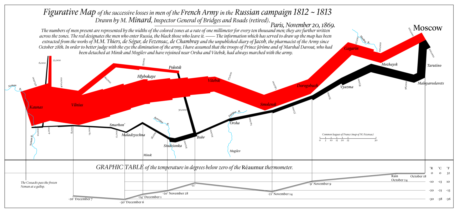
“The numbers of men present are represented by the widths of the colored zones at a rate of one millimeter for every ten thousand men; they are further written across the zones. The red (or beige depending on which version you are looking at) designates the men who enter Russia, the black those who leave it…”
The American statistician and data visualization guru Edward Tufte in his book “The Visual Display of Quantitative Information” has notably commented that this is one of the “best statistical drawings ever created”.
Taking a closer look
For me, the following are the top items that jump out. Note that I am using both an English (Red) and French (Beige) version of the map just to make things a little clearer for the examples. Many people have analyzed this visualization in way more detail but my top 5 items are:
1. Data layering – the way Minard represents SIX types of data in just TWO dimensions is amazing, he specifically overlays:
1. number of troops
2. distance
3. temperature
4. location
5. direction of travel
6. location relative to specific dates
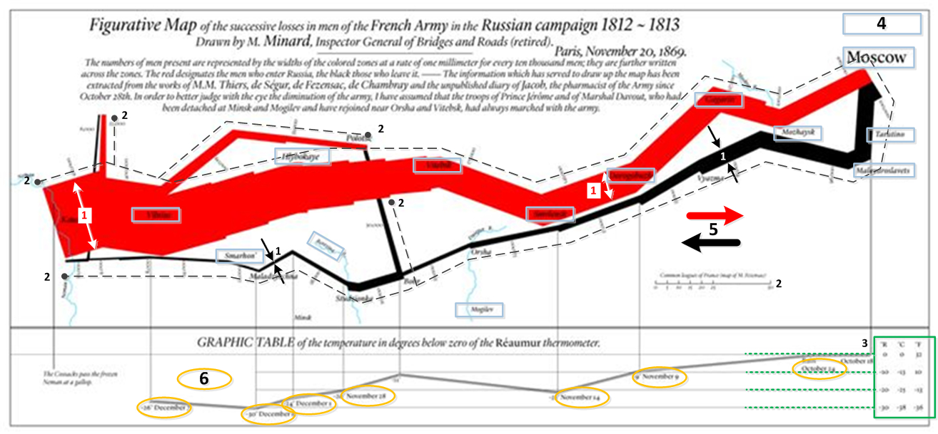
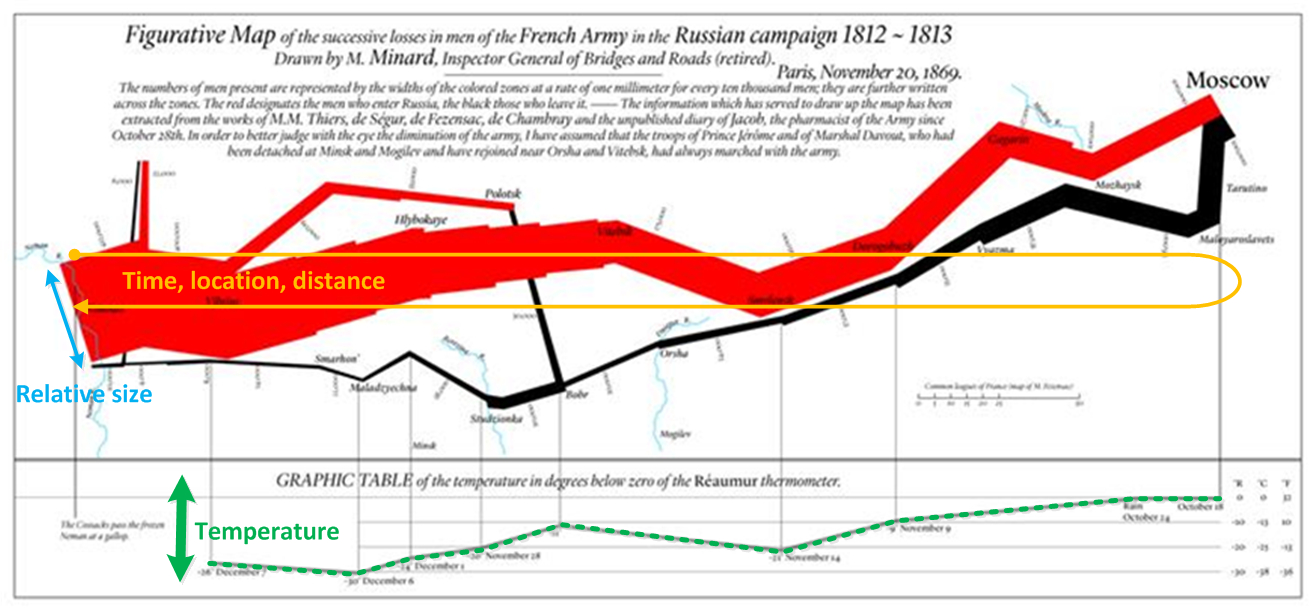
2. Change over time without a linear time axis – the ability for Minard to represent the change in this data over time (e.g. loss of troops, change in temperature, change in location) in a non-linear but intuitive way.
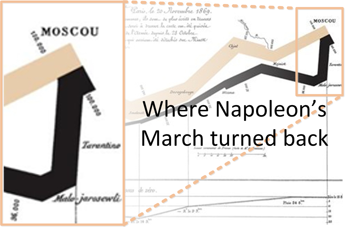
3. The minimal use of colour – only using two colours has a number of advantages, for me one of the things this does is to allow the reader to quickly identify a key inflection point in the story – specifically the location where Napoleon’s army turns back to march home.
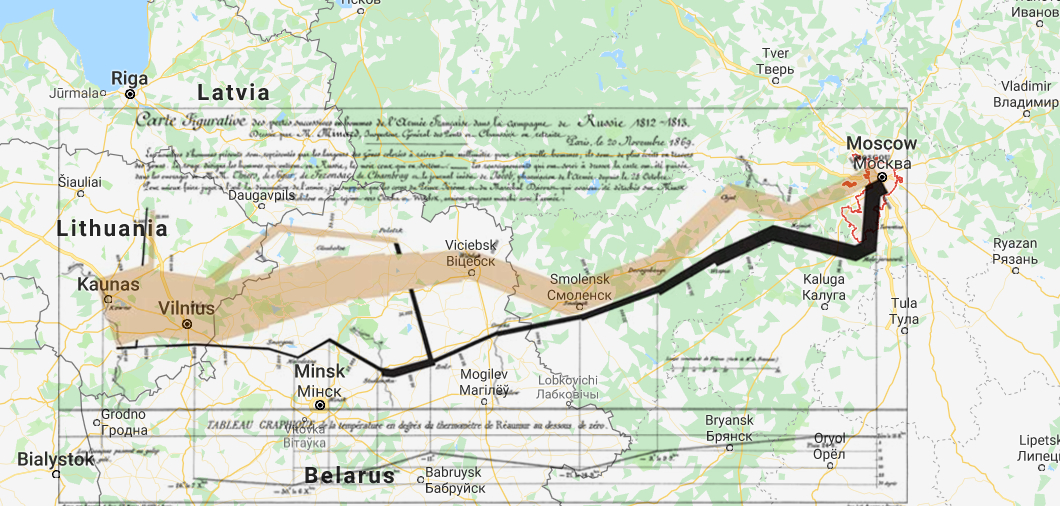
4. The abstraction of location – Although the map is geographically accurate, Minard was able to clearly show movement around a geography without requiring an obvious map layer which could end up being very distracting (see overlay graphic below). This allows the eye to focus on the story but by leaving in key pieces of geographical information the reader is not disoriented and always knows where they are.
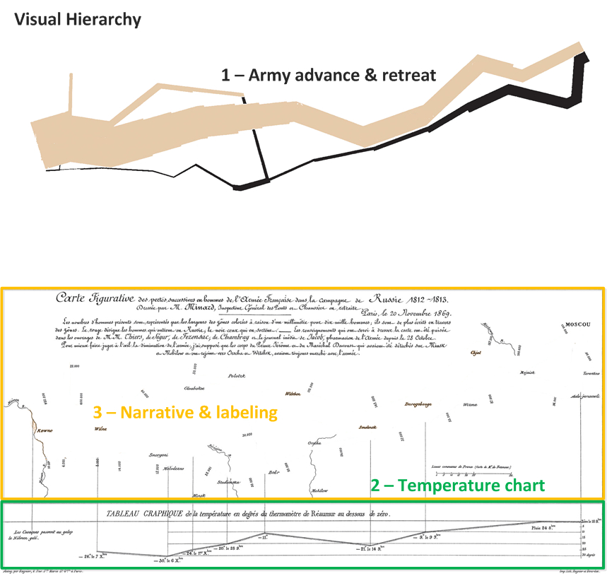
5. Intuitive Visual Hierarchy – Minard created an obvious visual hierarchy that allows the reader to absorb information at different levels very quickly. Our eye is immediately drawn to the advance and retreat shape and colour, it naturally drops down to the temperature and finally labels and narrative come into focus. For me the only really distracting item is the large amount of text top middle but I think Minard got away with it!
Three simple takeaway lessons
I could write a hundred takeaway points from this visualization but for me the following are the key three:
1. Tell a story – we all create graphs, charts, diagrams and visualizations without thinking about the story we want to tell. The story that this graphic tells would rank #1 if it were in the greatest books of all time
2. Abstraction of magnitude – Minard manages to convey changes in size of the army using the relative width of the two coloured shapes as well as its direction and location. Yes labels are there for temperature, date and locations BUT these are supporting elements that come further down in the visual hierarchy. The reader can make sense of the elements of the story without having to mentally process numbers in their mind.
3. Don’t be afraid of linking multiple dimensions into a single entity – we very often create visualizations one dimension at a time. This is often forced on to us because of the tools that we use but try and get creative in figuring out different ways of layering information
For those that are interested here is the March to Moscow in English:
Next blog post: Florence Nightingale’s Rose Chart
Sources:
- Unattributed, Christmas Specials article, The Economist, 2013
- Wikipedia (Charles Joseph Minard)
- Cheng, J, Thoughtbot article, 2015
- Tufte, E. R. The Visual Display of Quantitative Information. Graphics Press, Cheshire, CT, 1983
